
Holloway Concept
Vesion 1.0. June 02 2018
I want to show you my vision of Holloway product. I'll show a core idea how to make it more comfortable to use and read, how to interact with big data and quickly understand what it is about. I tried to pin some thoughts of people who really love to read books, ebooks and every time to find some information in the net. Let's get started.

1. Introduction
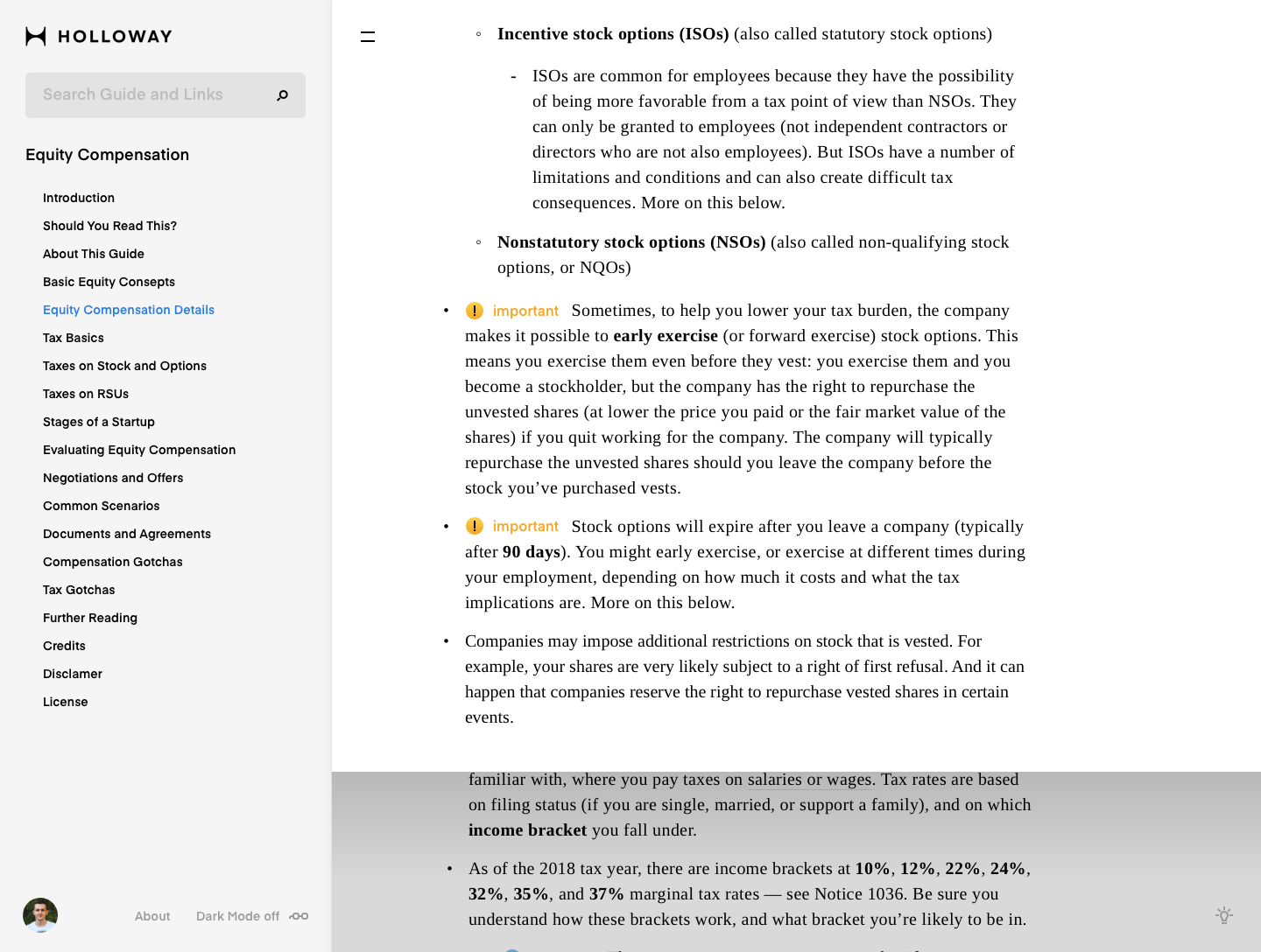
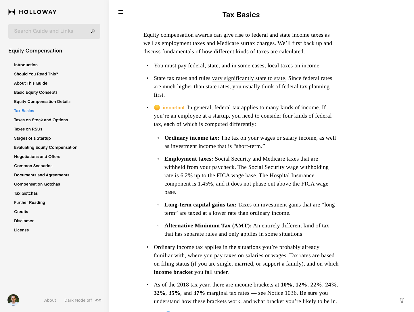
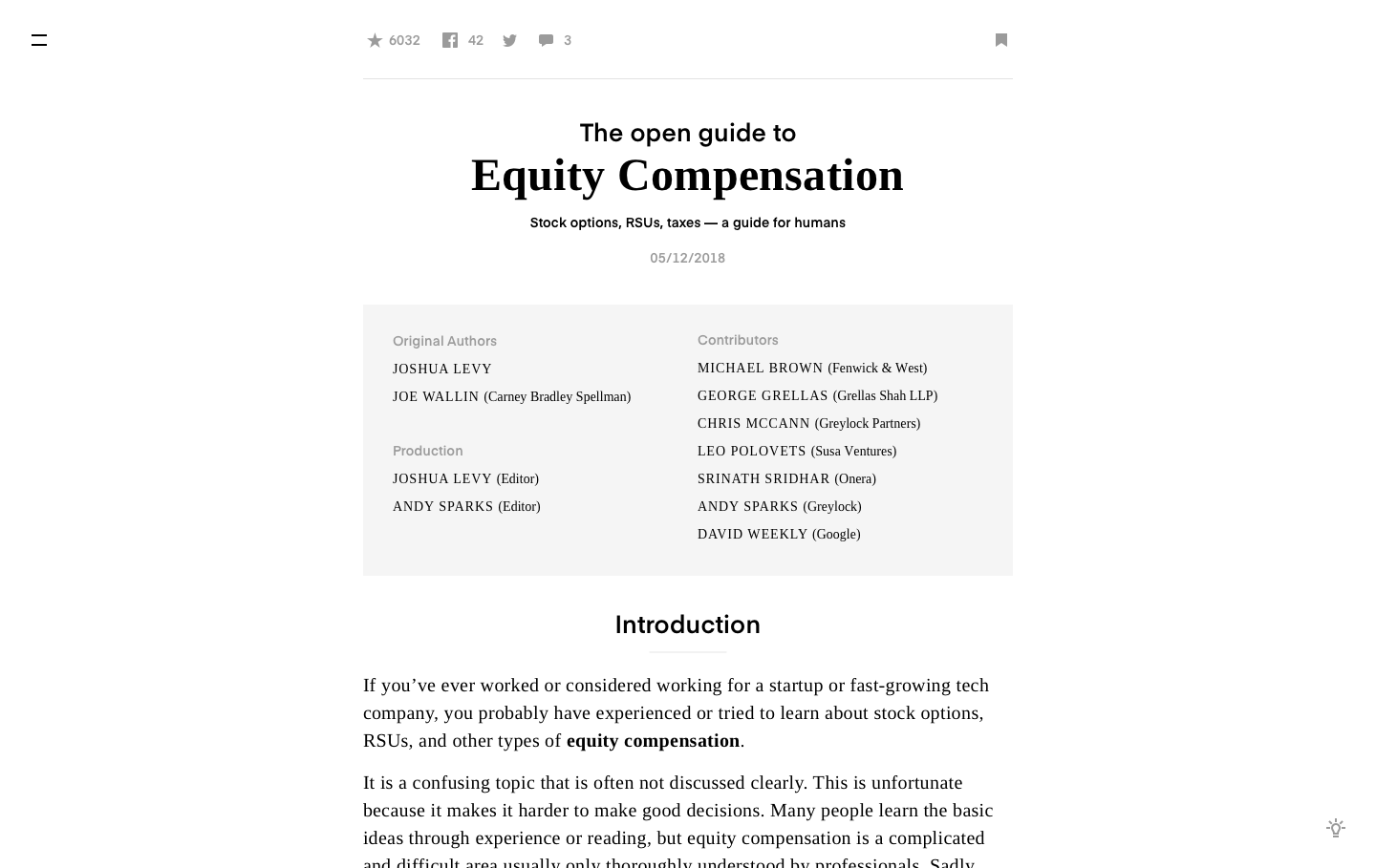
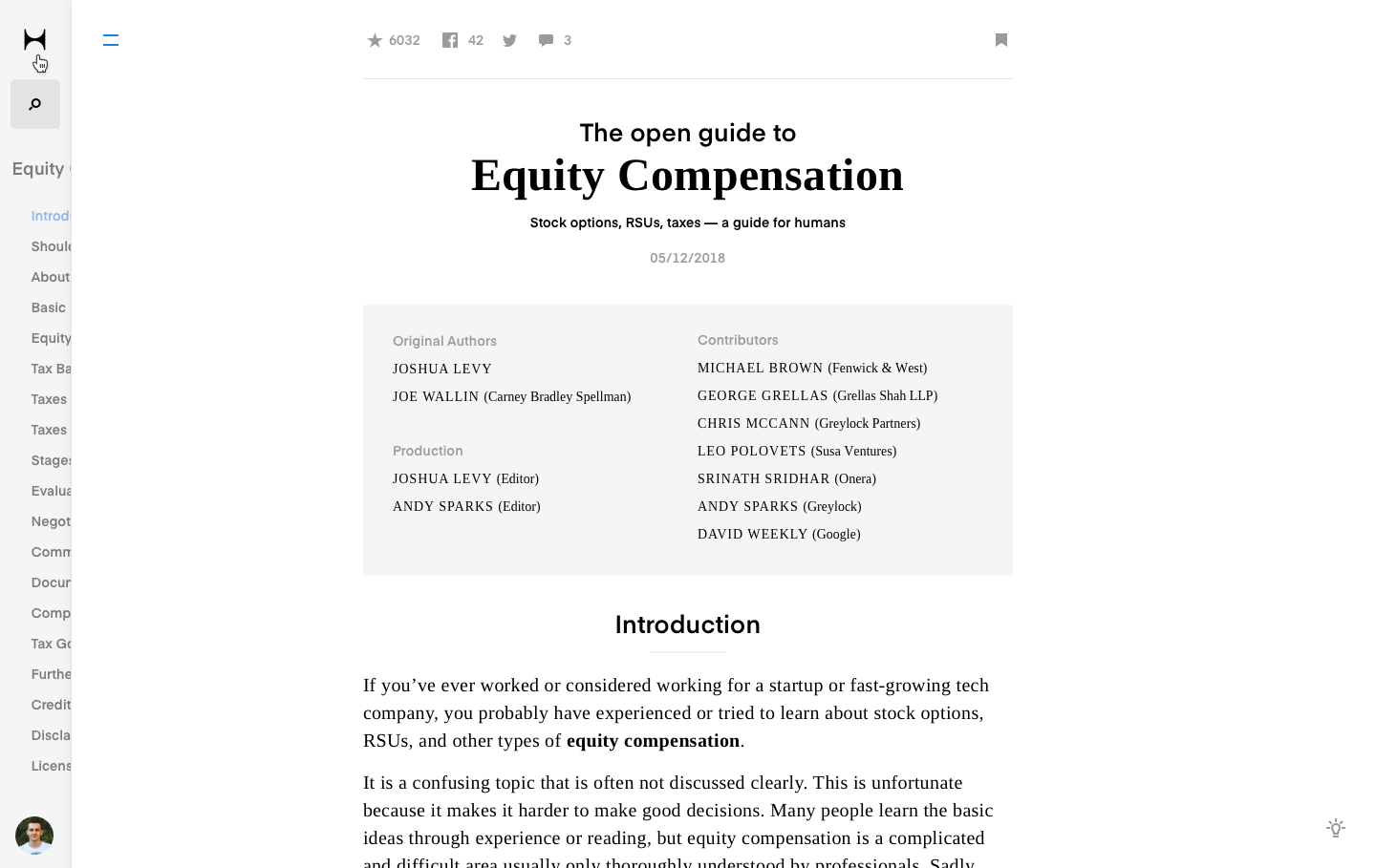
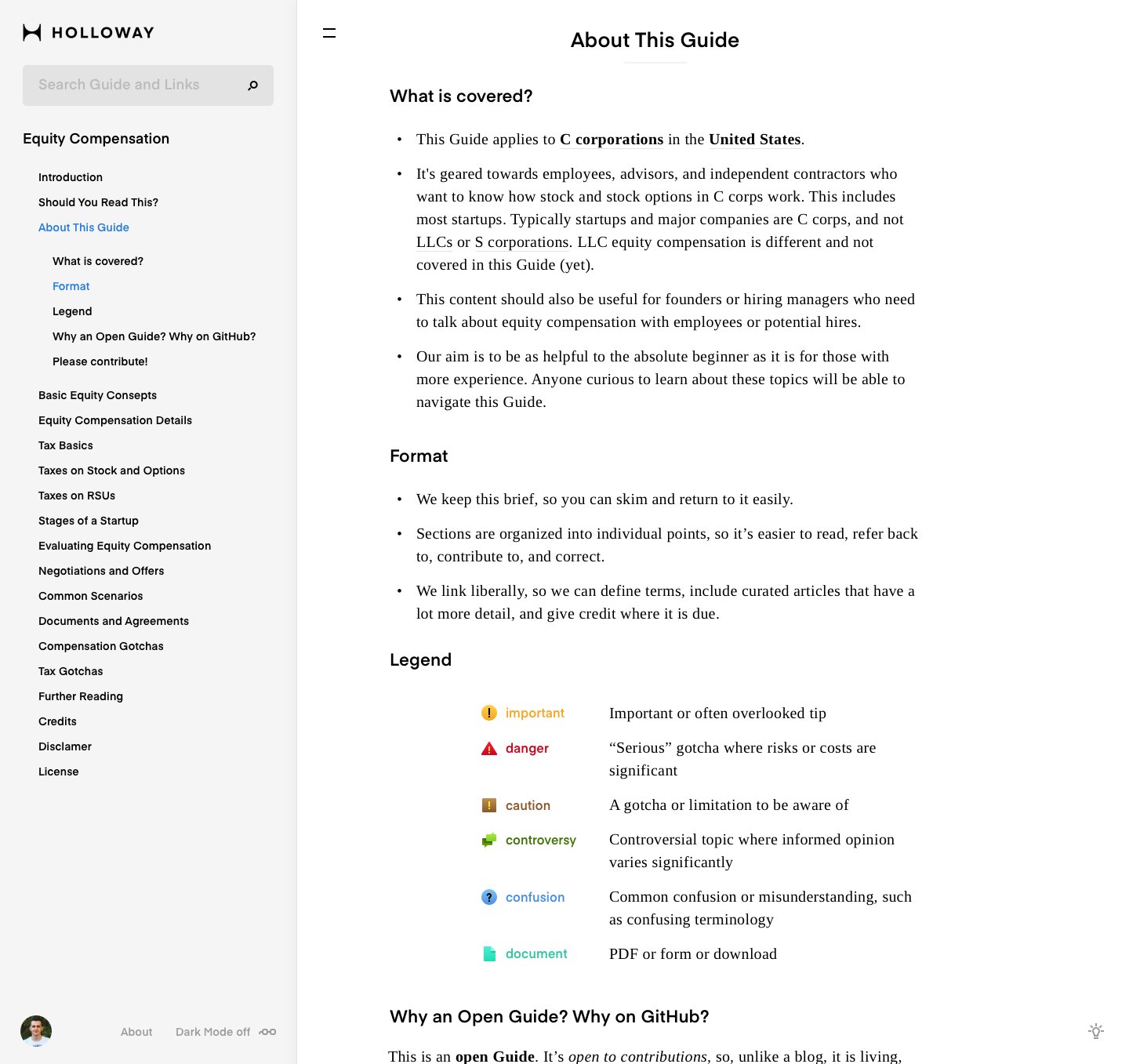
I saved general elements like in the current prototype: left menu and content. It splits the screen on two parts. In the menu we have all we should have like menu: search, table of contents, userpic (works like a user profile) and main links 'About' and 'Dark mode switch'. The right side has generally main content text, menu burger and navigation tips (bottom right). I've touched everything what you had already: logotype, fonts, colors etc. I ment I've change a bit everything for the main reason: to make order and neatness.
The fonts I used:
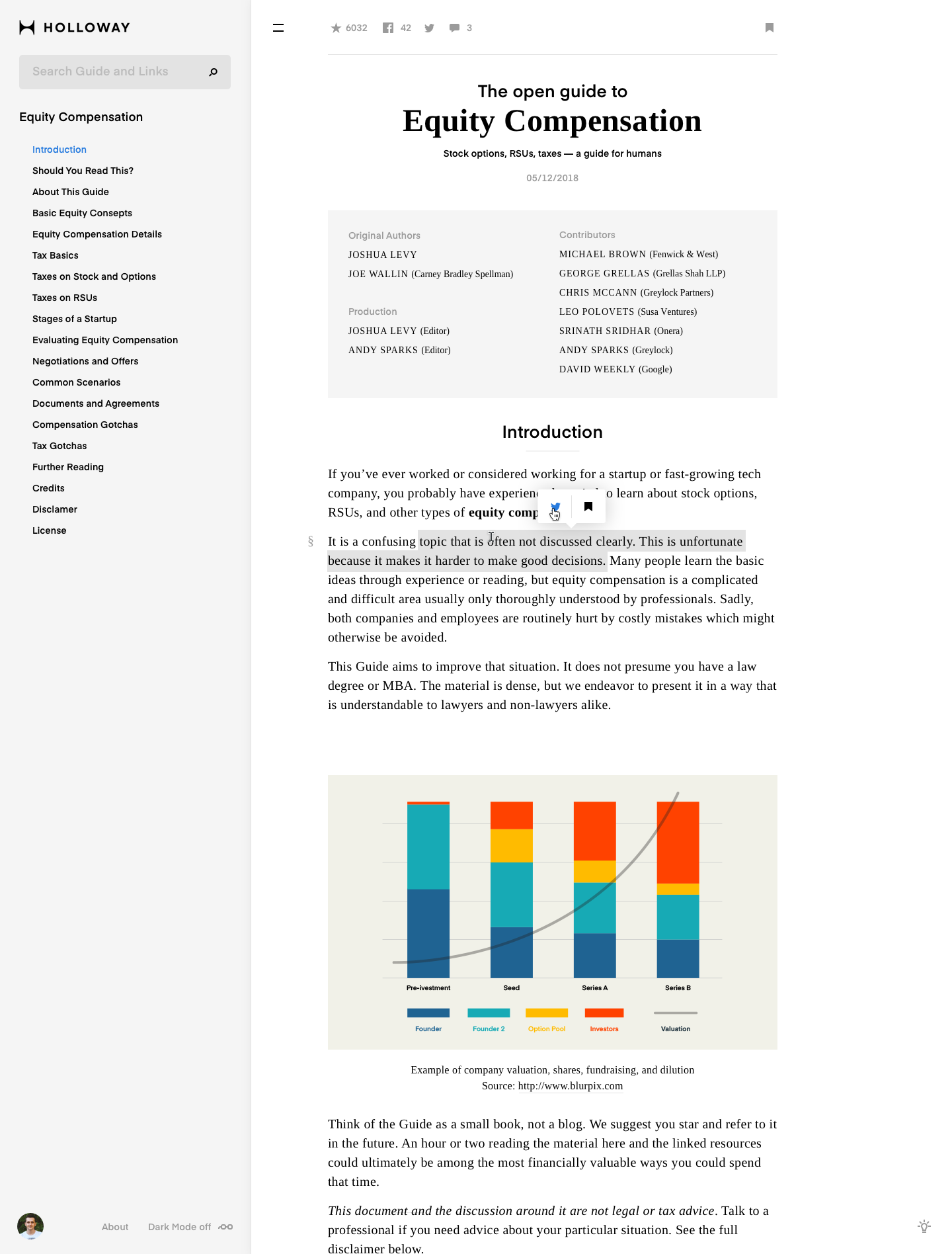
In this screen I show how we can orgonize general elements: left menu, main content (guide text) etc. In this case I came up with a text select with hover contains 2 ways of sharing: Twitter and Bookmarks. User wants to make his own bookmarks for ease orientation in these tone of information.

By the way. My name is Vera. I often read articles and some materials in the net and know about it everything what the typical user needs. So I will sometimes grab the keyboard from Max and write down my opinions about new sketches. Don't mind? :)
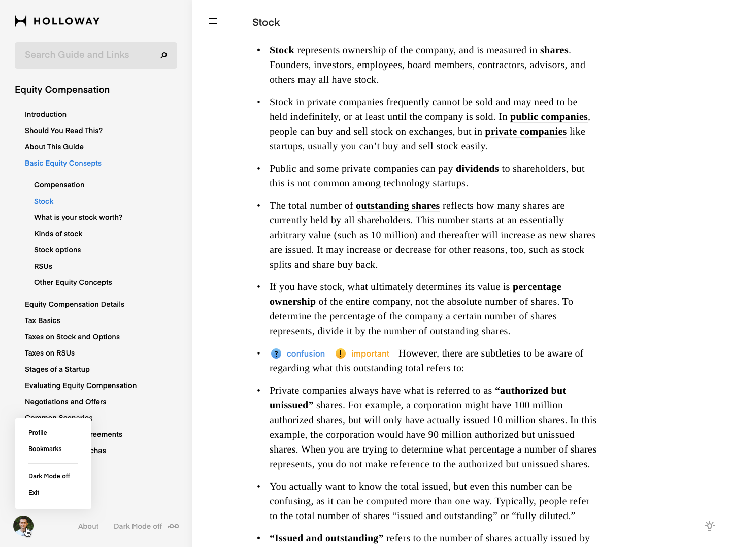
2. How to make addition
Some users have rules to write additions in the guide. When we hover on some paragraph on the right side we can see a bubble with 3 icons: Add an addition, Share via Twitter and add this paragraph to your bookmarks.
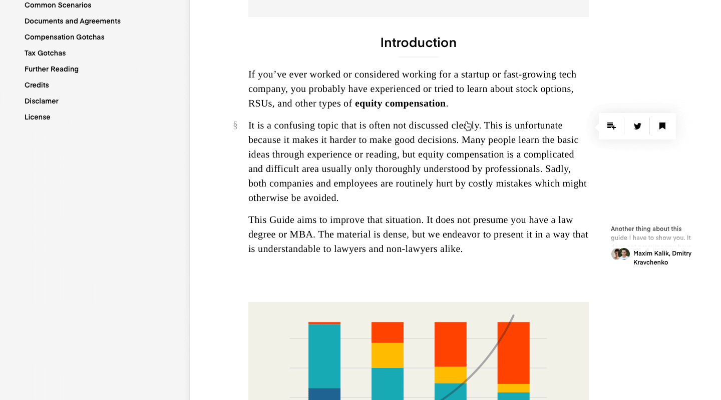
In this case I'd like to leave my own additions only for me (personally) because I want to note something everytime when I read tons of difficult texts. I'd like even to make additions and to send a part of text or whole guide to my friends or share with my additions.
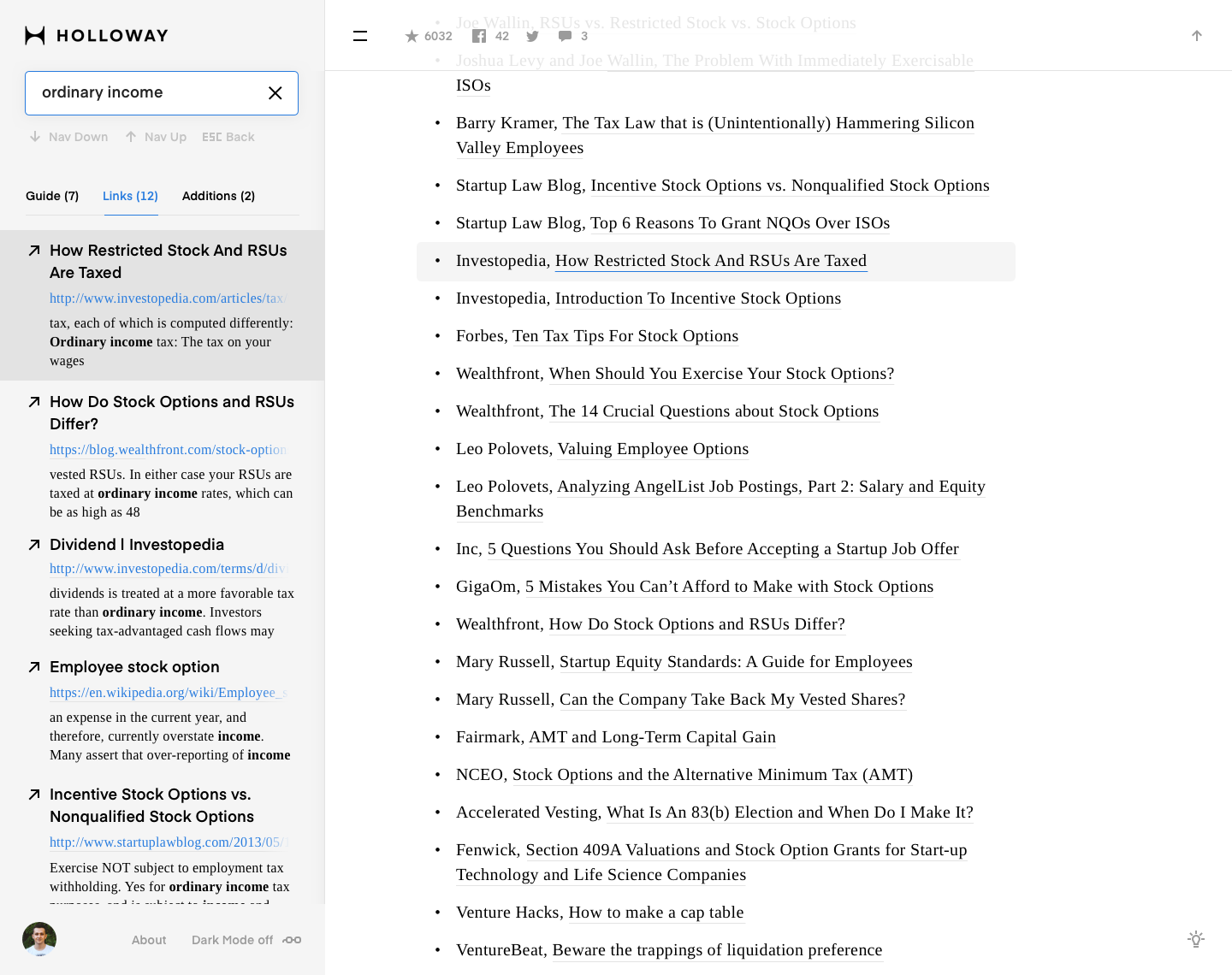
3. Search
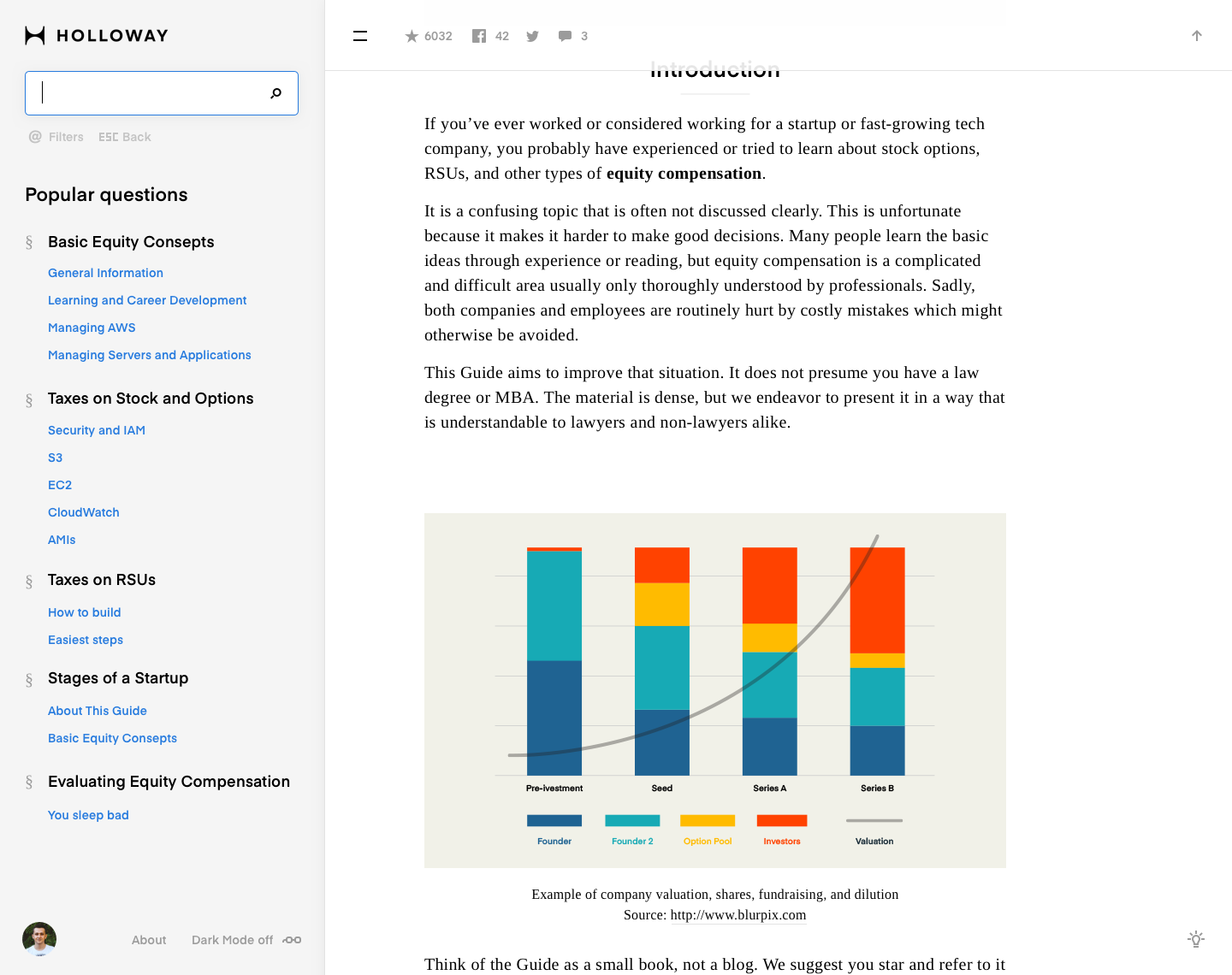
Search flow is not typical. The problem is that a user wants to see the search result and current text simultaneously without much changes on the screen. But the main content (text and additions) spreads 70% of screen. We can use only menu part. Another important thing is the input search field should be visible and work like assistant for user.
The input search field should be visible and work like assistant for user.
The field is on the top left side. When we click to the search field we can see instant suggestion: Popular questions from the other users. When we type something then the area below changes into the results split on 3 types: Guide (results only from guide text), Links (results of links) and Additions (results of additions what the authorized users put them in the guide).
While we are scrolling we can see the menu appears with sharing, likes and bookmark from above and it rolls up in the top if a user doesn't move the cursor.
Let's see animated flow:
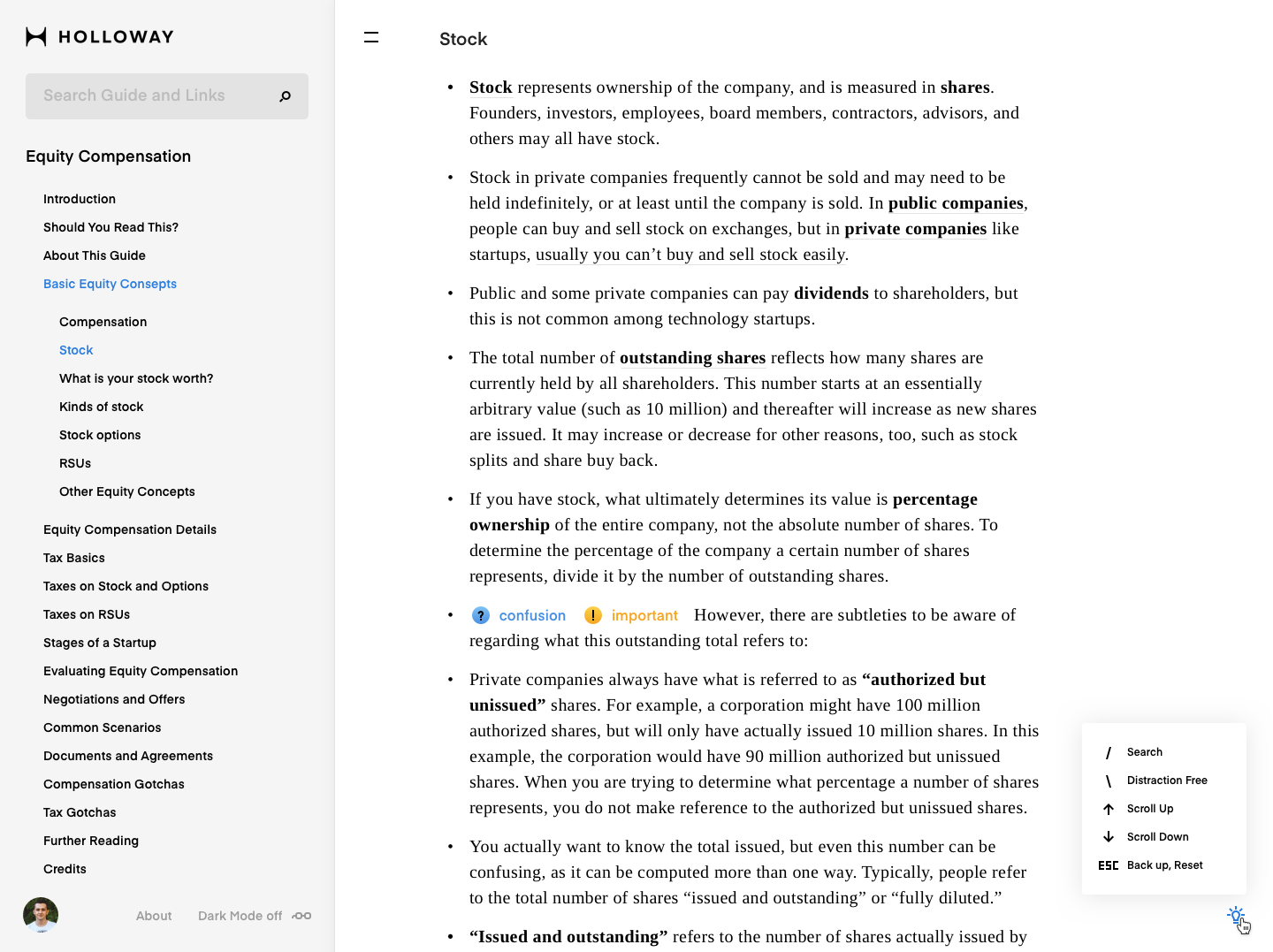
4. Scrolling
In the design, every detail is important. When a user reads a very long text roll he sould make breaks for a while especialy for his eyes. I made kinda 'page turning scroll' for more interest and convinient reading process.
I understand where I'm in the menu left. But I hope I'll can save my carrent page for the next reading time.
5. Menu
The left menu has been simplified. I've removed the indicating vertical lines which pointed where user are now and just left the color of the current selected link. It looks more clean and simple. We need simplified everything because we have a lot of texts.
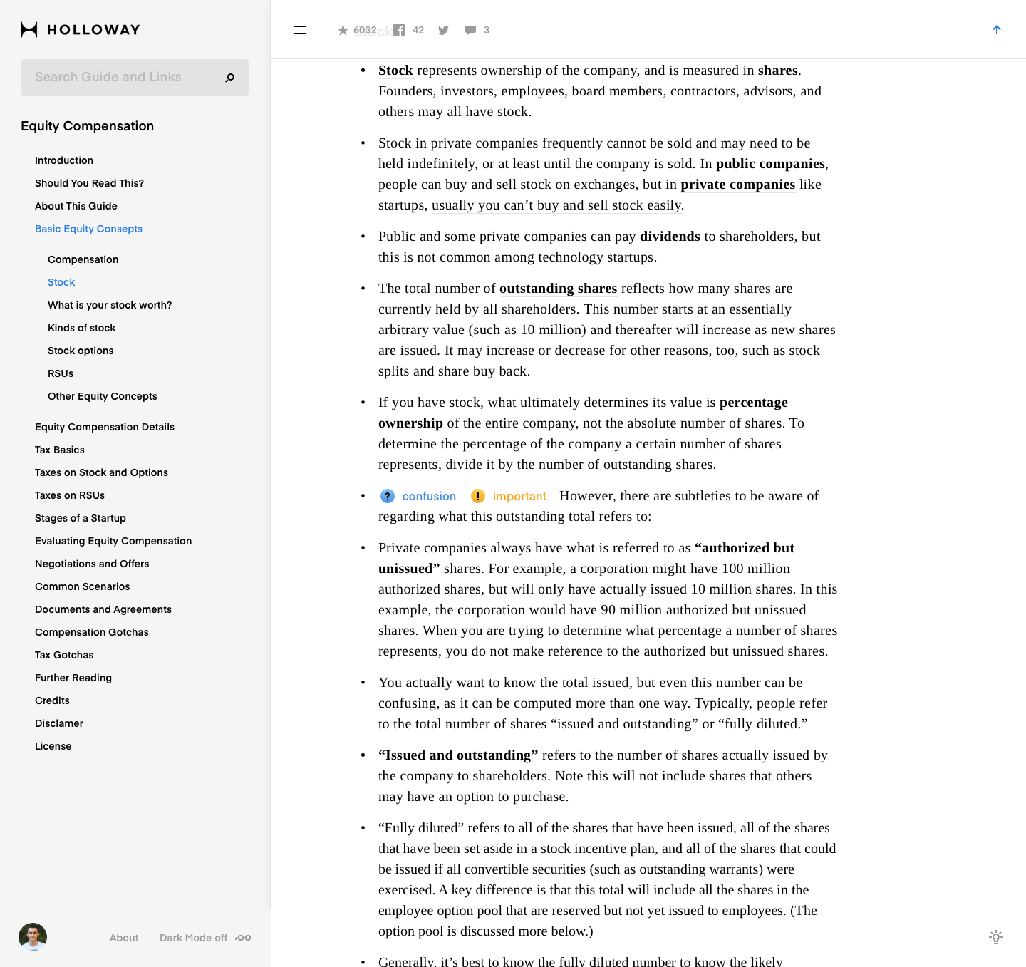
Another thing what we have to do so like that it's cleaning the screen at all exept the main content. It makes more comfortable user focusing to the current text. And let's add new feature when the user doesn't want to press the burger icon. Let him just hover on the burger menu and a part of menu will appear from the left side.
Other types of menu works like tooltip.
6. Emoji
User wants to pay attention to some part of text. The emoji can works like pointers where the user has to remember or take a look more carefully. Emoji will be made uncountable amount.
I want to take the floor: the emoji in the the text is unconvenient for reading. It will be annoying. It won't help me to pay attention. I won't may concentrate to the text and I'll stumble upon these emojies.
I might agree with foresaid. I'd suggest to make emoji beside of the text let's say on the left.
7. Darkmode
We are all use computers. But we use it differently. For example a lot of people likes PC meanwhile we are all love Apple Computers. What do I mean. Maybe it will be news, but many users like to read on a dark screen. That's why I made dark mode. We can turn it on in the left bottom menu nearby userpic. Check it out.
8. Mobile version
I assume 50–60% will use this guide through their mobile phones. We have to reinvent some moments in the sketches. Menu and especially search. We cannot show and result and content both.


Of course, these screens don't not enough for completely understanding how all things will work but we can make it in the future.
9. Conclusion
With UI and Visual Design we can approach the product to the high level. You know it. If we dive into the details we can make something really useful and we can help a lot of people to understand this product more faster. In the next step we can design onboarding, personal cabinet, bookmarks, user types, comments etc. And mobile version of course.
I'm reading a lot of information online and today I can't find ideal solution for me. I want to send my thoughts with part of text to my friends and I don't know how I can do it fast. I want to save part of text some where (getpocket I didn't find it convinient for me). I want to read the text everywhere - online and offline.
Links
All sketch files: https://sketch.cloud/s/4glnx
Process files: https://sketch.cloud/s/4glnx/p/bin
Thanks for watching. Have a nice day.